UX | Price Range
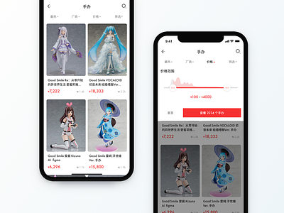
This concept is to improve the choice of the price range.
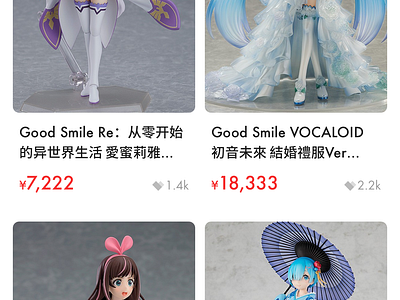
A lot of commercial APPs give users text areas to input the price range or give them some default tag like "1 to 50". The former experience is too bad when inputting, and the later isn't suitable for everyone. After they inputted some certain numbers or chose a tag, the result could be none. So the combination of the progress bar and graph can help the user choose any range they want. They can also see the number of goods directly so that they won't get the white page.
Do you like it? Or you have some better concept? Feel FREE to comment below. :)
app concept
app layout
chinese font
commercial
default
figures
filter
graph
heart icon
icon design
image gallery
list ui
masks
mixed fonts
price list
price range
progressbar
search icon
selected
sorting
View all tags
Posted on
Jan 5, 2019
More by Xin Mu View profile
Like


