Zfloos Logo

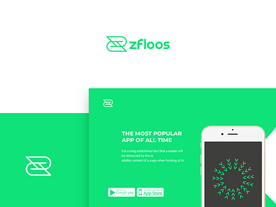
The new logo shape is simplified from the mother shape of Z family and the Dollar symbol design. We gave it a unique and memorable look. Shape created in the logo is to make sure that it is going to look good and functional on mobile app and online sites. Lines combined and designed to increase the trust feelings for the users of the App.