Privat Bank redesign

This is my version of redesign of famous Ukrainian Bank (PrivatBank).
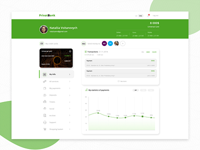
As an almost everyday user of the desktop version I was wondering why such a big bank doesn't have a clear interface, not cluttered with unnecessary notifications and dozens of buttons. So here is the simplified version of profile with notification bell added, ability to switch the languages, the important information about your card goes first in the header. The last but not least - I gathered all necessary buttons in 1 place ( left side menu ).
I hope you'll like it! ;)
Let me know your thoughts.