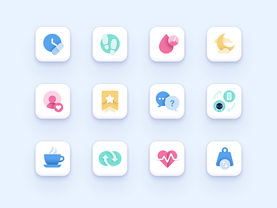
Pillo Health App Icon Set
The icons we've made for Pillo are simple, but colorful and informative. As this is a companion healthcare app, design elements are to be natural-feeling and comprehensible, so that a person may be fully immersed into the interaction and doesn't have to make any additional efforts for understanding the purposes of buttons, screens and tabs. Thereby, the icons serve like little managers, explaining processes and states, and these managers need to be flawless. 🙂🙂🙂How do you find them? See full case here
Press “L” on a keyboard to share some love and follow us if you don’t want to miss our upcoming works!
♥
We add heart to technology.
■
Looking for icons design? We are open to new projects! Feel free to drop us a line at ☞ contact@415agency.com


