A fantastic redesign

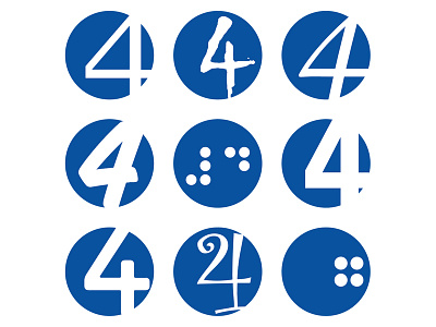
Am I the only person who thinks the Fantastic Four logo is overdue a redesign?
Top left is the original - then I went crazy. They need a whole family of them for use on different titles, like when they do a "... vs Zombies" title they should crack out a different version, do a Nightmare Before Christmas crossover and crack out a different version.
Now I'm looking at it, the bottom right looks like a weird bowling ball - not sure I'm happy with that. Oh yeah, and the middle one is "4" in braille.