What if Microsoft designed Google’s icons? (Free download)

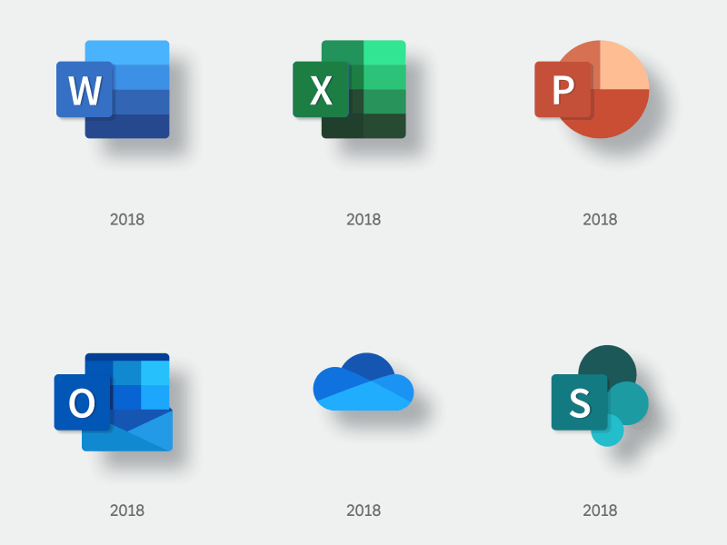

It's exciting to see that Microsoft followed Google's Material Design’s example – getting closer to the physical world and its textures, trying to reimagine the mediums of paper and ink. It was only natural to loop this philosophy back to a more tangible (Material) Google Icons experience and test how they'd look if we followed Microsoft's design look and feel.