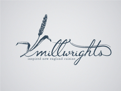
Logo Concept reworked

I've been playing with this all night and was continually feeling like something wasn't right. The first thing I changed was the 'ghts' was playing tricks with your eyes and looking like they were taller than the other letters, so I shrunk them down a tad and kerned them in a little more.
The next major change I made was I dropped the stem of the wheat down so that it mimics the descender of the g. Then I heightened the t to again mirror the wheat within the letters.
I think it's finally starting to come around. The last things will be do go through once more to smooth any unwanted bumps in my curves and figure out the best way to give the lowercase L a little character. I feel like they shouldn't be 100% identical.