Re-Phyll Brand Identity – Logo Design & Illustrations

Supporting a new purpose driven brand like Re-phyll is close to my heart.
Re-phyll is a new Zero Waste Bulk store selling plant-based, cruelty-free, natural, organic and ethically sourced dry foods, personal hygiene articles and cleaning products. In store you’ll find pasta and rice, tea and coffee, nuts and seeds, herbs and spices, bamboo toothbrushes, shampoo cubes and much more.
The shop helps environmentally conscious and socially aware consumers on their plastic free journey. Zero Waste stores across the world are offering people the opportunity to really make a difference in reducing food and plastic waste by offering sustainable products. Re-phyll true to its motto "Living a kinder life".
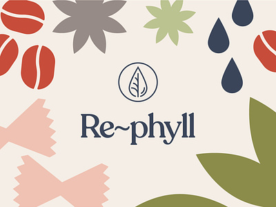
To help Re-phyll on its journey to become a loved and trusted brand, we have created a full brand identity with a welcoming, fun and engaging feel that is clean and contemporary. The logo symbol playfully combines stylized elements of the brand name – a drop of liquid to symbolize the concept of the shop ‘Re-filling’ and a leaf which is the natural source of Chlorophyll. In addition to the flexible logo system, a warm and natural colour palette and characterful typefaces capture the personality of the brand. Simplistic illustrations of some of the store’s distinctively shaped products bring all brand identity elements to life.
See the full project on www.ziskadm.com
Follow me on Instagram and Behance