BA | Rebrand Challenge

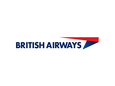
Here it is... My final outcome for my British Airways challenge.
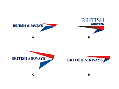
I really like how the logo mark supports the iconic SpeedBird symbol and a movement from serif to sans serif for the main type. I just feels it keeps it a more contemporary edge aswell as keeping the traditional values.
I also like how the serif font can be used in sub brands such as the Executive Club.
I have sincerely appreciated all likes and comments on this fun exploration. I know not all will be happy, but such is life in design. ❤️
Follow ∆ Studio–JQ ∆
SkillShare Classes | Behance | Instagram | Twitter | Pinterest | Facebook | YouTube
All Works Copyright © 2018 ∆ Studio–JQ ∆
lease note these are just concepts and not a real project. Ie British Airways own the rights to their name and original logo etc...