


Georgetown College Brand Identity Design

In 2018, Georgetown College launched their new brand identity. The objective of the brand identity work was to modernize the brand while maintaining a link to the heritage, traditions, and mission of the college. The identity needed to standout, be versatile, easy to identify and recall, and be relevant to the mission of the college.
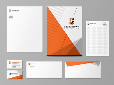
The brandmark for Georgetown College is a direct link from our heritage to our future. The design is built of three distinct elements: the shield, the diagonal, and the GC. The shield is a direct link to our heritage and communicates the strong academic foundation on which the college was built and has maintained throughout its history. The diagonal expresses the duality of Georgetown College’s mission: 1. to provide an exception educational experience and 2. provide that experience in a vibrant Christian Community. The diagonal’s direction represents a commitment to positive upward growth as an organization and for our students. The GC is clear, modern, and approachable; it creates the perfect balance for our brand. The GC breaks out of the inner shield to indicate the unlimited reach of the college’s graduates, faculty, and staff within our community and throughout the world. The connectivity of the GC also serves to communicate that we strive every day to be inclusive and to break barriers, to be innovative and to strive for connection to the common good.