Framing and Branding in Messaging
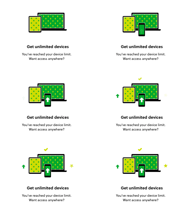
With our brand refresh back in August came the opportunity to explore and play with how to use our bold new look to add visual polish and create emotionally compelling moments in the UI. Our previous style employed a lot of human elements like characters and faces, which made it very easy to communicate different emotional states like celebration, or loss. Over the past few months we’ve been experimenting with how to push the new brand to craft these types of messages in similar ways. One approach we’ve taken has been to explore using animations to illustrate positive and negative framings of the same message. In this experiment we tested positive vs. negative messaging (with animations to match) on users who have reached their device limit, to see which framing inspires more people to upgrade.


