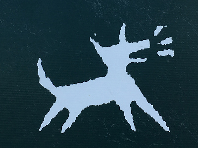
Jones Architects Logo

I was out walking the other day and spotted this sign hanging on a fence outside a newly renovated house. I designed this logo a few decades ago when I was just starting out (fresh out of art school).
The story behind it? My friend Phil Jones had just moved his established architectural business into a new office space. It was an old council building that was formerly the 'Dog Pound'. I remember helping to remove the old cages when I helped out with some of the initial renovations.
Phil specialises in the rejuvenation of stately old homes so his current logo was pretty conservative. I was surprised when he went for this quirky little number. We paired it with a 'safe' serif font that seemed to do the trick.
This is one of those 'draw it on a napkin' moments that transfers really well into the final design.