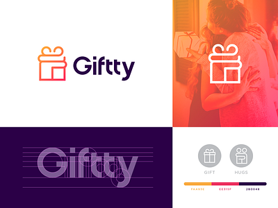
Giftty Branding
For the project creation of Giftty fully immersed emotions are involved, it can be a word of thanking, a feeling of happiness, or a sensation of affection.
The line which marks it all - A 'Gift', is the main thread of this identity. It doesn't cover the whole story, what about the pursuit of giving and receiving and the zeal of spirit of the giver and receiver? We needed a togetherness of these for a completion. The form that connects from inside could express it. So the element which I could find to suit best was in the form of a 'hug'. These key elements were in extreme entity when coming to designing, so the most challenging was the merging of a thing and an expression in a faultless blend and balance. Lucky, I have achieved in creating the perfect flawless mixture which is quite an abstract style and brings curiosity to the viewers. With that, I have expanded a fully customized typography for the brand name to match the design. Aside from giving a brand message, its color palette could reveal the mood. Very fun and happy colors are chosen for this project, to avoid maximum dullness. Even though you had suggested some exact numbers, I found it to be less vivid for the brand
Let me know your thoughts!


