


Brooklyn Nets

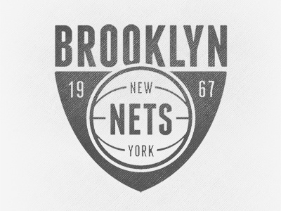

My take on Jon Contino's take on Jay Z's take on the new Brooklyn Nets logo. Sort of a merger of the two concepts. Wanted to keep all text reading horizontal in a tall, clean sans serif, harkening the old NY subway signage. See full size for variations.