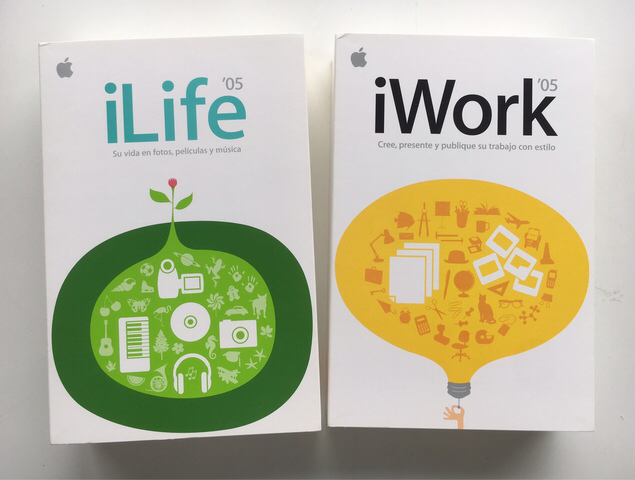
iLife and iWork ‘05


One of my first projects with Steve was to redesign the icons for many of Apple's apps. Steve was incredibly hands-on, leading weekly design reviews where he would scrutinize every single icon with a relentless attention to detail. He would often request multiple revisions, pushing us to constantly iterate and refine our designs.
One of Steve's key philosophies was that design should be functional as well as aesthetically pleasing. He believed that every element of a product, including the icons, should serve a specific purpose and enhance the user experience. This meant that every detail, no matter how small, had to be carefully considered.
During these design reviews, Steve would frequently ask questions like "Why did you choose this color?" or "How does this icon represent the function of the app?" He wanted to understand the thought process behind each design decision, and he would push us to think critically about how we could improve the user experience.
Working with Steve was both challenging and rewarding. His high standards and attention to detail helped shape our design philosophy at Apple and contributed to the company's reputation for creating beautifully designed products. It was a truly transformative experience, and one that I will always be grateful for.