


The Media Company

Logo Concept for a random media company.
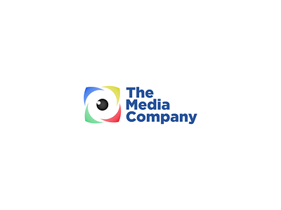
Different colors to represent different moods that the media could bring but also what the company itself is about.
Red for excitement / boldness
Yellow for fun / communication
Green for growth / peacefulness
Blue for reliability / strength
Black for creativity
White for balance
All these colors combinations have been seen before, but well, it's still relevant to the industry!
The logo shape in itself could have multiple meanings:
1) The eye looking to its top right which means it is actively creating something in its mind.
2) The eye also represents the lens of a camera.
3) The exploding box represents the creativity of the company trying to get out of the box but still having a view on the boundaries.
4) The four arrows going to different directions to show expansion and diversification of the company in the media industry as well as always moving forward in its ideas and conceptions. It also shows the company is looking at different directions to leave little to no path unexplored.
5) The whirlpool or tarnado in negative space which represents the mix of all of the above as well as the strength and speed of the company.
Gotham is used for the typography.