77 final version

This is the last identity proposal i put together for a client of mine. apologies for the post, pull, repost.
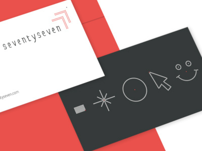
Seventyseven is an IOS app consulting company that provide app design and development. The client requested an imperfect looking logotype, hand crafted but not scripty like you would have seen in my earlier attempts & complimented by a mark of the number 77 that was more graphical by nature, more refined and not organic like the type - a tricky marriage indeed.
I decided to create this mark out of 77 dots with the focus on the 77th dot. In doing this I have manufactured a flexible device that can change shape to represent different icons associated with the company all using 77 dots. These devices will be used in conjunction with their collateral and we have plans to animate them and make them interactive.
you can see the full presentation here.