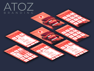
My Vodafone Albania App Design
This is just a concept of My Vodafone App design. Been using the My Vodafone App for a while, and I feel that there have to change its design immediately. I find it "difficult" to use, except the fact that its pretty slow.
I came up with this design, each box represents the telephone numbers, where the client can click in one of the numbers, and the menu of the exact number will show up, giving to the client the info he is looking for. Its kind of difficult to see here the exact UI Design, but I hope you get the idea.
My critique on this design is that I've been using too much RED color. Lol. But since this is just a concept, I ended up with this design. If they chose my design as the new interface of the App, I can of course update it a little bit.
Hope you like it!

