⏱ Daniel Screenshot Tool


Made some changes to Daniel's shot. Key takeaways:
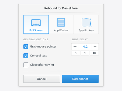
1. Timer was biggest pain in the ass. Spent 2 hours designing chronographs, gesture-based illustrations, buttons, pluses, minuses. Finally came to the simplest options with sweet details, like number is blue to indicate it's activity (0 will be grey).
2. Tried to add subtly depth using light-shadowed separators.
3. Redone some native checkboxes and changed ticks to be more "flexible" and human. Megazoom to see 🙂
4. Made everything aligned to flexible grid. The main point was to keep even balance of the window and make the composition work for the last "big" action — screenshot.
5. Tried to make more obvious illustrations, but adding names helped a lot!
I'm listening to any feedback as usual.