


Didone Experiment

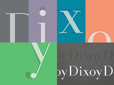
What goes together better than a Didone typeface and a Sunday brunch? Decided to take a break from all the geometric sans-serifs and revisit the classic Didot typeface.
Didot has such a strong, distinct tone and is not fitting for many web-based projects. I spent a day trying to dress down a Didone typeface to make a version that was friendly on screens. Changes included lower x-height, shorter serifs, reworking proportions.
Think of it as a two-button version of a three-button suit.