Alignment Rebound Suggestion

Maybe a window would prove to create even more of a friendly environment, but I'm sure you've tossed that idea around?
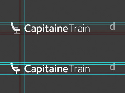
I also felt the same about the chair sitting to high and felt it was a little large for the type. Instead of trying to explain, I rebounded this shot. The height of the chair meets the height of the 'p' 'descender' (now ascender). I think the chair is more tucked in which stresses the comfort concept.
I love that you were able to push past the train concept after so much development and were still able to 'arrive' at yet another solid logo comp! That being said, the chair looks way comfy! I always enjoy your shots and explanations :)
</suck-up>