NASLADDIN Branding

client
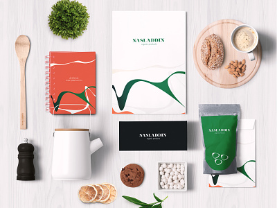
Russian producer and retailer of organic food and beverage.
issue
Our task was to develop a new brand position and visual identity for the premium market segment.
solution
The name NASLADDIN in Russian means "to enjoy". To reflect the brand mission of encouraging people to enjoy life through access to healthy food and beverage we created an elegant identity with nature touch.
The inspiration for identity we found in organic forms and colors of nature. By following our minimalist design approach we used elegant organic pattern and very clean and sophisticated colors palette.