PixelCamp - Final

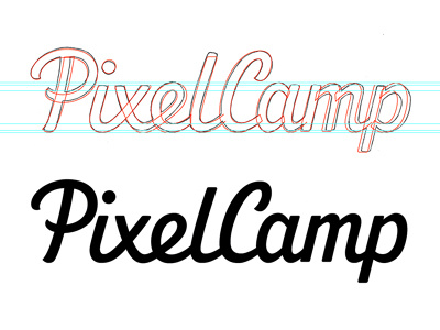
Final PixelCamp logo after revisions. Thanks very much to everyone for the excellent suggestions on the previous shot, it really made a difference! I made the 'P' bowl bigger, slightly adjusted the 'e' angle and weight variance, shrunk the gap between the words, widened the 'C' a little, widened the 'm' and what made the biggest improvement, smooth junctions on 'amp' (rather than the angled ones previously).
More images and process write-up on my portfolio.