Carlsberg Rebrand – Lock up & brand typeface

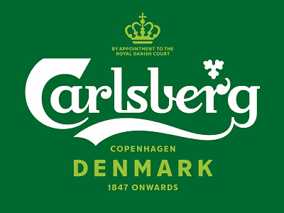
Following extensive research into the brand's 171-year heritage, Carlsberg's famous brand elements have been carefully re-crafted for the first time in several years, striking the perfect balance between form and function.
These assets combine to form a coherent master brand-led identity system that works across packaging, promotions and POS materials for all of Carlsberg's global variants. The core elements include the logo, hop leaf, crown and brand typeface, as well as the signature of Carlsberg founder JC Jacobsen.