End-ish
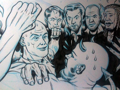
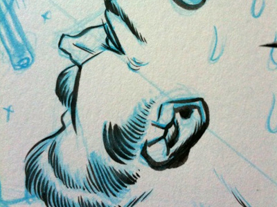
End-ish. There are a few niggling details that got hit with opaque white or corrected digitally. But this is pretty much done. The space not seen at the top is for the band and album lettering.
Coloring will emphasize the foreground figures. The background figures are messy and get in the way. If I had my choice, they'd be gone or much less prominent. It is still successful in spite of that, I think.
View all tags
Posted on
Sep 1, 2010
More by Ray Frenden View profile
Like


