Chronos Logo Set

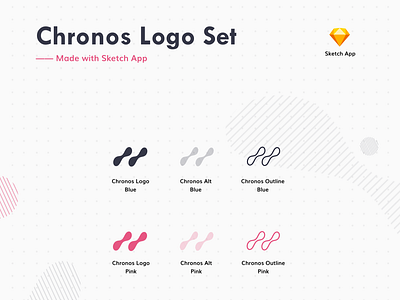
We are currently rebranding and I have become a bit obsessed with these squiggly designs recently. I am always a fan of logos that do not necessarily have a literal link to the project - if you build a strong enough brand, the association with the logo is a given.
A key part of our business is the fluidity of payments and that money can move in "streams" as opposed to just lump sums. I was partially influenced by old-school animations of rivers with wiggly lines and decided to sketch out some ideas with that in mind. This is the final version.