


The Hangar 1.5


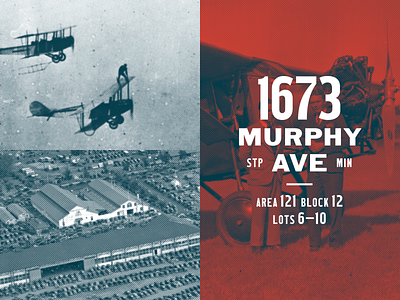
Here are some more graphic bits from the visual language and brand identity for The Hangar at the Minnesota State Fair. This address lockup was hand painted on the building, and the "quartered" layout and design system was implemented across the counter fronts at the POS.
