Social Security Benefits Calculator / Daily UI 004

Redesigning the SSA's Quick Calculator
It looks like some pages of the current Social Security Administration have been undergoing an update, so I’ve used the same menus and style. (style reference: https://www.ssa.gov/planners/retire/AnypiaApplet.html)
See the current page: https://www.ssa.gov/OACT/quickcalc/
Changing the menu and breadcrumbs:
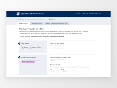
The current menu and breadcrumbs can be confusing to some (seen here). I’ve made the breadcrumbs a little more obvious by using a more standard style and clearly marking them as links.
The tabs are currently very subtle, so I’ve made it a little more clear that the tabs are related to the information below. This takes some weight off the menu and focuses on the content. (I’ve updated the tabs to be the types of calculators instead of various types of content. This is because on the current SSA website, once you click through to a calculator it’s not entirely clear where you are.) (I also understand this could likely use some more thought)
Content that’s better for usability
Because there are a number of calculators on the SSA website, I added a “This calculator is best for” heading, followed by some info on number of questions and how long it will take to fill out. Signposting and setting expectations are key!
A simple form update
Based on Mitchell Renton’s case study, I changed the birthdate format.
Finally, I made the size on everything much larger than usual. At the end of the day, the average age of citizens concerned with their Social Security benefits is likely higher than say, new signups on slack.com