Vivaura Logo

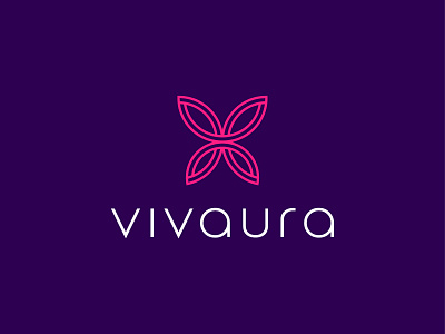
Approved logo for Vivaura – an Italian photography business.
The concept is derived from the name – a combination of positive energy and feeling alive. A butterfly was chosen to symbolise this message, with a subtle letter 'v' visible within the arcs of the wings. Custom typography was created for the wordmark to highlight the unique personality of the photographer Arianna. A strong and vivid colour palette was selected to further emphasise the concept.