Another attempt...
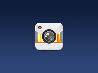
This is probably my final attempt at designing an icon for Gifture. Right now, the β icon does nothing for the app. It's bland and has no connection with the app what so ever. I thought this complimented the app well since we're sporting a very light colour scheme. Also tried to implement the "Pull to Refresh" UI that we have.
Hope you guys like it! Feedback welcome.
PS- We're hoping to be on the App Store sometime next week!! VERY EXCITED!
View all tags
Posted on
Apr 7, 2012
More by James View profile
Like

