Alumni Association

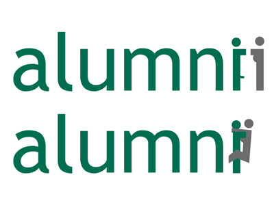
This is a blast from the past. I was working on an identity for an alumni association for a university in NYC (about 4 years ago), and this was about halfway through the process. The idea was to use the 'i' in alumni, reverse it, and use it as a second figure to represent the idea of an alumni association bringing former students together.
Boy, did it do just that! I was doing some rough vector drawings, experimenting with type studies, color palettes...and was doing all of this around 1am. I think I had a design 'blackout' and didn't realize what I was working on...because when I came out of it, I had this on my screen: http://www.npgraphicdesign.com/badfonts.jpg
The first rough PG13 idea is at the top...followed by the insanity. Think the logo achieved the desired objective?
Just thought you guys may get a kick out of it. The final logo did end up being PG13, and the client never saw these.