Waterfall Chart


Here's a snapshot of Waterfall Charts from my recent project "Your guide to Data Visualization". Check out the complete project on Medium and Behance.
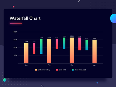
Waterfall charts demonstrate the cumulative effect of positive and negative values in a sequential manner on a variable. It helps us understand the effect of the positive and negative values on the variable under observation, allowing us to draw a comparison between the initial and final value of the variable. The variable is drawn as a bar resting on the X-axis with the initial value of the variable plotted against the Y-axis. The sequential negative and positive values are depicted as floating bars that affect the initial value leading to the rightmost bar which represents the final value of the variable. These charts are named waterfall charts because they look like a waterfall.
Check out the example above that draws a comparison between the inventory maintained by an e-commerce platform in the first quarter of the year (Jan to April). Let's look at the month of January. The yellow bar is the inventory at the start of the month. The red bar, immediately after the yellow one, denotes the number of units sold that month. The green bar denotes the number of units procured that month. If you subtract the red bar from the yellow bar and add the green bar to the remainder, you will get the bar on the right - the inventory for the month of February.
Best Practices for Waterfall Chart
1. Ensure that the bars depicting a change look visually different from the regular bars.
2. Denote negative values in shades of red and positive in shades of green as they're fairly accepted colors for a decrease and increase.