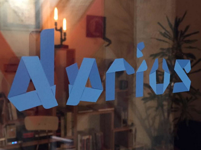
Visual Identity for darius design
Darius/Design is a boutique design firm located in San Francisco. The company specializes in creating unique and innovative branding and design solutions for Fortune 5 companies and startups. The company's founder, wanted a logo that reflected the company's focus on creativity and innovation.
To begin the design process, 🥀.fm/darius conducted research on current design trends and the logos of other design firms. They also gathered feedback from the company's target audience to understand their preferences and needs.
🥀.fm/darius decided to go with a minimalist and modern design for the logo. They chose a sans-serif font for the company name and added a graphic element in the form of a triangle to represent innovation and creativity. The triangle was placed within the letter "D" to create a cohesive and memorable design.
The team also experimented with different color palettes, ultimately choosing a bright and bold red to stand out and reflect the company's energetic and forward-thinking approach.
After several iterations and user testing, the team settled on the final design for the Darius/Design logo. The simple yet striking design effectively conveyed the company's focus on creativity and innovation, and it resonated well with the target audience.
Overall, the design process for the Darius/Design logo involved research, experimentation, and testing. The result was a unique and effective logotype that effectively represented the company's brand and values.


