Type treatment for a strenght sports brand called Heavy Iron.
This was made a few years ago and did not get to see the light of day.
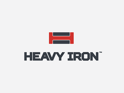
The logo mark includes a "H", an turned "I" and also the overall shape is of a girder to give it a feel of "heavy"
Behance • Facebook • Instagram • Twitter