Revisions & final

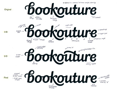
I didn't have the time to post during while working on the revisions unfortunately, but this is the further development of the Bookouture logo (printed tests). Original on top, two of the revised alternates in the middle and final, approved version on the bottom. Tried out some variations for the 'b' loop/swash, but in the end went back to the original one for its flow and distinctiveness. Subjective of course but in any case, it's definitely attention-grabbing. (To better balance start/end of the word, we changed the 'e' tail instead.)
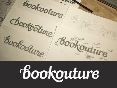
A sincere thank you to everyone for the fantastic, very thoughtful feedback and suggestions on the first version. It was really helpful and much appreciated, both by myself and the client. Couldn't have asked for anything better!
Full size image (with annotations at an actually readable size) and process write-up on my portfolio.