Velo logo Process

sped up video of the process. I dont like much sped up videos cause they offer little value however I thought just telling you some key points I did through my process would help
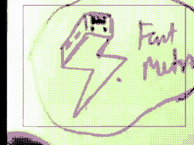
1. my uploaded sketch turned to 60% opacity , then locked and on a new layer I trace over with the pentool 2. rounded corners to bring the logo together more, sharp corners make logos look like clip art or too robotic, using the round corners feature in illustrator is a good way to add a more softer and human feel to the entire thing 3. same stroke and perspective, youll see that im trying to make everything similar to each other, each shape and style needs to match each other, the perspective of the train shape is copied many times to add consistency to the design 4. devil in the details, I go in with pentool to make adjustments where necessary manually, use your eyes see where the inconsistencies are.
let me know if this helped in anyway and if youd like more of these dissected process gifs