


Image Clinic — Home Page UX

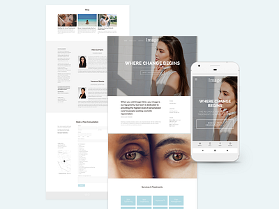
Another website exploration for Image Clinic, scrapped a lot of the earlier exploration to focus on a scrolling page design. But also considering that it might be harder to scroll on mobile due to smaller screen sizes, I really wanted to focus on optimizing long-scroll pages.
—
To do this, I began to structure out what the most important content would be for display: The clinic's overview, contact information, services, blog and philosophy.
It was important to really focus on content design and strategy, ensuring the most vital information is displayed and keeping in mind that content should be readable within three to five scrolls.
The main goal of the website is to allow users to easily book a free consultation, so the first CTA presented on the website allowed users to do just so with a click of a button presented within the first scroll. But if a user plans to skim through more information to learn more before booking, a sticky burger menu is accessible at all times to re-direct them to a desired section, as well as a Squarespace-enabled mobile information bar appearing at the bottom.
An announcement bar will also be displayed at the top for exclusive promotions or important clinic updates.
—
Going forward, I'll be focusing more on the service and product specific pages. These pages will be separate from the scrolling page and are meant to inform users with detailed information about the clinic's service offerings as well as exclusive products available for purchase in-store.