Thirty Logos #3 : Twitchy Rabbit

Day 3 of the thirty days!
#ThirtyLogos
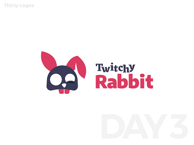
The logo is for an email-based marketing firm, requesting a redesign of the old logo which was previously too-detailed and lacked functionalities as a logo.
I admit, this is one of my failed logos. Although the scalability is improved, it still isn't very effective in small sizes. The shapes rather forge an image of a skull than a rabbit (or a dead rabbit, at its best) and has no relation to the mailing aspect of the business whatsoever. I uploaded this just so that I can finish up the challenge from #1 to #30.
You can learn more about Thirty Logos challenge here!
____________________
Thank you for viewing my work!
Press 'L' to show love!
Contact me through mail