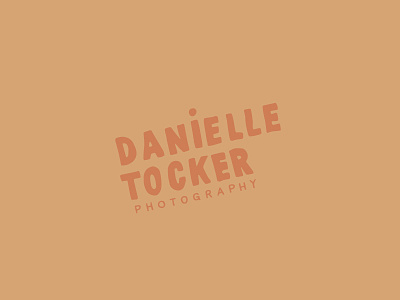
Wordmark Typography Concept
Another idea for bringing in the playfulness into the brand was by tracing a simple, geometric sans serif, but leaving in some those messy hand traced lines.
The logo will likely also become a stamp, which adds to the clean but undone style.
View all tags
Posted on
Jul 2, 2018
More by Alicia View profile
Like


