Re/brand Style

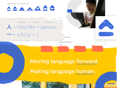
Rebrand style tile I worked on earlier in the year for a language assessment company. Using a bamboo brush and sumi ink, I created my own versions of diacritic marks, and paired with Cera Pro to create a visual brand that was technological but also human and organic at it's core, like the languages of our world. The logo mark explored has multiple meanings, but the primary meaning is that of "one person"/"we are one".