LeaderSource - Identity Proposal 2

LeaderSource - Identity Proposal
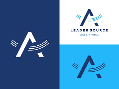
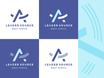
Been refining my latest logo proposal for LeaderSource, a service which equip churches to build healthy (Christian) leaders.
This concept includes the ^ element which also should refer to "movement" and "upward". The 3 strokes stand for a "ripple" effect or "wave" to visualize a movement. It also visualize "a step" forward. I also refined some color suggestions since they felt better suiting to the current organization.
Curious to hear which version you think works better, the top with the simpler line or the version below with the triple lines?