NetNutri Mark

NetNutri is a web-based provider of nutritional supplements, vitamins, herbs, weight loss, bodybuilding, and health & wellness products.
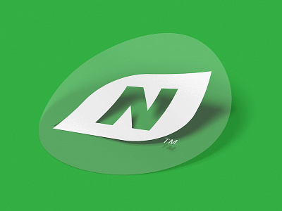
The NetNutri wordmark features a modified variant of Helvetica Neue Black Italic. The “t” crossbars have been removed from the left side not only to provide increased distinction but also resulting in a more compact, versatile mark. Similarly, the tittle of the “i” has been replaced with a leaf, providing direct visual communication of nutrition, health, wellness, and growth. Its visual weight communicates strength and stability while its italicized characters convey quick response, adaptability, and forward thinking. An additional alternate "N" lettermark (featuring the "N" and leaf shape from the wordmark) was also created to provide increased versatility for the brand.
NetNutri's colors, purple and green, were chosen not only to aid in brand recognition during NetNutri’s rebrand but also due to their psychological associations with quality, creativity, pride, harmony, nature, and growth. The NetNutri logo is established, strong, and confident.