&...I'm torn

So, I need some help from the Dribbble community here.
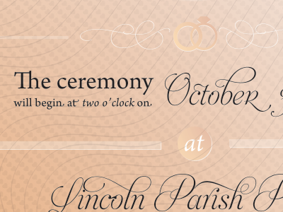
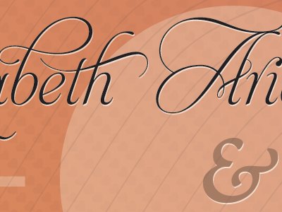
I'm torn between having a darker more saturated background vs having a lighter background. I'm having some slight concerns about the typography (being to difficult to read) and I'm not sure how that white around the letters is going to look.
I love any feedback! Full-size here: Weddingness Invitation
This is a big file.