MP redesign concepts

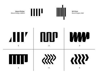
Up top is my current logo, meant to be a very minimal interpretation of my initials. I've used it since college. A couple of years ago, I came across the MIT Press logo, done way back in 1962, and what do you know: same concept, similar execution, even the same letters. Womp womp.
I find designing for myself to be weirdly intimidating, so I put off redesigning my logo for a while, but it's finally time to take the plunge. So here are a couple of options I'm considering. Still going for minimal and geometric, just trying to put some more distance between me and MIT Press. Any winners in there? Have any of these already been done? Critiques/suggestions also welcome.