


TECH–K Homepage


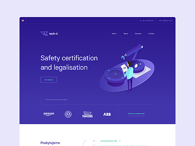

Hey everyone! Here is the shot from our current website project – a simple website for a tech company called Tech–K, where we also did the corporate identity design. Unfortunately not naming :-( This company is doing machines safery legalisation and certification for big companies.
What's important here? We've tried to create something fresh and clean looking and instead of using too much white and grey "tech" clichés we chose cool looking vibrant colors to make this brand stand out. With Michal, we've created also some nice illustrations to give more human approarch to this whole thing. What do you think about that? Not every tech website / brand should look boring, hm?
You can check also the full homepage preview here.
Also give us a follow if you like us 😉 Facebook, Behance, Twitter or Instagram