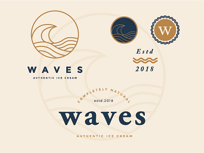
Waves Final Logo

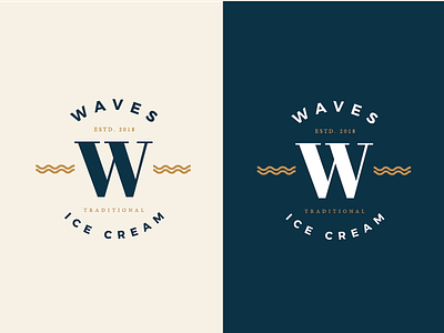
After some back and forth with the client, He ultimately went with this version of the logo. Simple waves mark that can be made into the foundation of the identity system and a clean traditional serif W to give it that premium and tried and tested feel.
What do you think?
Twitter: https://twitter.com/FarrelNobel