Cerebriform Boxing Glove Illustration


Update 11/23/21: This blog post contains a detailed breakdown of the design process that went into this illustration (along with a follow-up case study for the book's successor): https://medium.com/@a_kill_/book-cover-illustrations-the-design-process-eb5995c87b90
Update 12/11/18: The book is now available for purchase at https://www.amazon.com/dp/B07L5Z6V75 (but the cover has been updated to a new one due to a change in the visual identity of the brand).
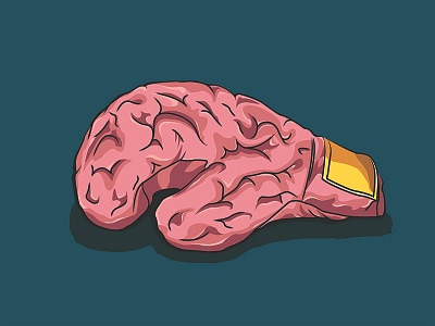
An illustration to be used on the cover for an upcoming book about mental health. The theme of the book is to stop battling against anxiety and instead view it as a survival mechanism for personal growth. The idea is to "give up the fight" and learn to let go.
I felt that a boxing glove would be a very apt metaphor here, as it is an instantly recognizable symbol of power and strength. For those suffering with anxiety, it can often feel like their mind has this kind of powerful control over them. So I illustrated the brain with a cerebriform texture to visually bring to life the link between the brain and the mental battle that anxiety can make someone fight within their own head.
Regardless of whether or not you're suffering from anxiety, the illustration triggers an immediate visceral reaction at first glance, which is one of the things I was shooting for and one of the things I love most about how it turned out. It's a combination of two extremely different and disassociated things that come together in a powerful and very impactful way very quickly.
Since the theme of the book is to "let go" of this desire to fight this anxiety, I wanted the glove to always be in a relaxed and resting position. I did not want it to be in motion or pulling powerful punches. I especially think that the gloves hanging (see attachment) conveys the sense of "giving up the fight" quite well, where the person has learned to live with and overcome their anxiety, so they hang up the gloves and retire them for good.
This illustration went through multiple iterations to get it to feel just right. There were versions where it felt a bit too demonic with all the curves and pointed edges of the brain folds, and versions where the color felt too bloody and deadly. The color contrast on the highlights and shadows especially had to be tweaked a fair bit to not be jarring and discomforting. The combination of the brain and glove itself is already a very powerful metaphor, so the visual details didn't need to try as hard to sell the idea.
In this final version, the visual details take a backseat and allow the overall theme to shine through. I'm very pleased with how it turned out.