Jaku - Readability

Though process: This one proved extremely challenging and I ran through 4 complete designs before settling on this one.
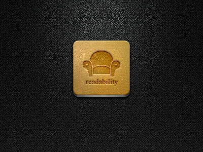
The idea behind this iteration was to sell the icon based entirely on the texture (made entirely from scratch and comprised of 7 layers), something I've been practicing for a while now. I wanted a product the user would want to actually feel and rub with their hands if they could. A texture that almost begged to be felt and stroked, but remained subdued, gentle and soothing, as is what Readability's design aesthetic is all about.
As you can see, I tweaked their logo ever so gently to add a little more detail (as that's my forte). If you haven't already, do check out their iOS app. It is exceptionally done and they are just a phenomenal crew who really have greeted the community and its support with open arms: http://itunes.apple.com/us/app/readability/id460156587?mt=8
Logo and name are trademark of Readability: https://www.readability.com/
It's now included in the latest version of Jaku (1.4.1): http://www.szilveszter.ca/jaku