


Selecore V2
Located in Finland, primarily focusing on iporting new innovative products and secondary focus is in exporting items produced in Finland. Client wanted serious, modern and strong logo. He also mentioned that he loves when the logo has a hidden feature or message.
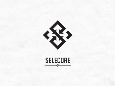
In the mark letter "S" is made of arrows pointing inside (import). In the negative space you can see arrows pointing out(export). The negative space also forms a cross which is connection to Finnish flag (I will try some Finnish blue color later).
I appreciate your comments, thanks in advance!
P.S. Please help me choose which type matches better V1 or V2? Thanks!