Dutch Bros logo evolution

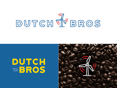

1 hour logo designs — Just for fun, I tried to update the current Dutch Bros logo. I changed the heights of the capital letters and adjusted the letter kerning. I also recreated the 'Coffee' text. From this stage, I decided to create a more contemporary feel to their logo, update the colors and icon.